Get In Touch
Samanabad, Lahore, Pakistan
info@smartpictorial.com
Ph: +92 302 4526158

Case Studies

Case studies capture a variety of perspectives, as opposed to a single picture of an individual via a survey or interview. This allows for a better knowledge of the subject at hand while also reducing the possibility of prejudice by diluting a certain individual's purpose. Our dedicated staff analyses the project and comes up with solutions. Some projects are shown. Let us have a look.
case

main

Bike Share Mobile App Design

BikeShare app design was our first project, and it was a huge success. Our team works tirelessly to suit the needs of our clients. BikeShare was launched in March 2021, but after the first few days, participation and retention were minimal. Some individuals would uninstall the app before even testing out the program’s unique features or motorcycles. A significant percentage of users who had the app installed on their phone had low activity.

Our Client Goal

An experience-driven strategy required us to initially focus on UX Research Methods (surveys, emails, and user interviews) in order to identify user pain areas. In a resource-constrained context, we employed an operational efficiency method to get closer to our aim.

“Improve user experience and retention by identifying user pain spots within the app while keeping the expense of developing entirely new features in mind.”

bike sharing
bike

Understanding the problem space

It all began when our founder, Josh Squire, introduced shared bikes as a simple way for Chicago residents and visitors to experience the city. We launched BikeShare after being inspired by the success of shared bicycles in Chicago. BikeShare has deployed smart bikes in over 15 places across the United States and Canada in a relatively short amount of time. We wanted to discover what people’s issues are with bike sharing and build an experience to address those challenges.

compititor-analysis-2

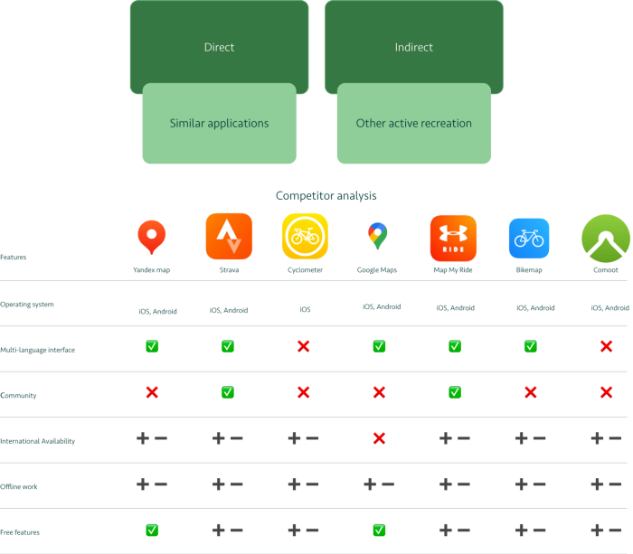
Compititor Analysis

The relatively out-of-date research from 2015 to 2020 revealed some interesting findings. While there were 70 apps available for bike sharing at the time (now 100), some were duplicated, some didn't work at all, and a huge number didn't fit the study's fundamental criteria. Only 23 apps met the engagement, usefulness, visual aesthetics, and information quality criteria. While the study is old, it gives us a decent sense of the quantity vs. quality gap.

Research

A path to reach new conclusions

To better understand the needs that people have and their pain points, we defined a series of questions and began researching the problem.

Important Questions

  1. That are the people who using sharing apps? What do they utilise to communicate?
  2. What are the present market conditions? Market insights aided us in this endeavour.
  3. What apps are currently available? What applications do people enjoy and dislike? To further understand the problem space, we conducted a competitive analysis.
  4. Why do people prefer to ride their bikes together? And what are their present issues?
  5. We performed user interviews to validate our market research-based premise.
  6. We examined customer comments in numerous apps to have a better picture of what other issues exist in current apps.
  7. How does a solution make you feel? Rapid prototyping assisted us in determining whether we were on the correct track.

Mobile App Design

Design Process

At this point, it was critical to establish who our potential consumers are, to instil empathy in them, and to determine what problems the solution will answer.

It was possible to understand the challenges that consumers encounter, their goals, motivations, and expectations, as well as the context in which the product will be utilised, with the help of UX research.

This data enabled us to test how the initial ideas fulfilled the needs of people, ultimately resulting in the creation of a product that will be liked and used.

When the collection of information was completed, the analysis of the data obtained was carried out: patterns in the results were identified, users’ problems were compared with the proposed solutions, and new ideas were formulated.After compiling user stories, a user flow was built. Based on the user flow, wireframes were developed.

At the UI design stage, the visual part of the interface was created: the main colors and typography, icons, illustrations, etc. were chosen.
Tools

In my research, I used the following methods: JTBD, Personas, CJM.

When building my design process, I used The official Double Diamond design model, that consists of four phases: Discovery, Definition, Development and Delivery. This model has helped me to build my design process and optimize it.

JTBD

JTBD's purpose is to come close to the user's genuine desires. As a result, the user has a task to perform. He is looking for the greatest product to assist him. JTB assists in determining why people purchased a product in the past and predicting if they would purchase it again in the future.

Personas

Following the JTB research, we learned who our users are, what their requirements and expectations are, and how and why they will use the product. A collective model of the person was constructed based on the information supplied that includes demographic (gender, age, city) and personal information.

CJM

After developing a persona, I visualised the user's interaction with my programme. What exactly are we doing at this point? CJM is a user journey map that I created (customer journey map). When building a mobile application, we employ a universal marketing tool.

Research Process

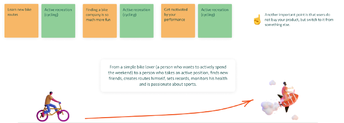
The global goal of a person is to become better, and the product should help with this.

Research process
research data

Step 1

First of all I define competitors.

Step 3

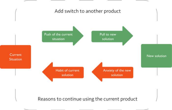
The next step is to formulate JTBD Hypotheses. There are 4 forces that influence the decision to change products.

Step 4

Timeline. I move the user along the scale of progress, showing new work.

Step 5

I formulated questions based on 4 forces that influence the decision to change the product.

Step 6

Next, interviews were conducted with three users of different levels: with a professional and cyclists, to understand how this product fits into the lives of those who will use it.

Step 7

Next, Job Stories were formulated, for each Job Story I’ve created 4-force canvas.

User flow

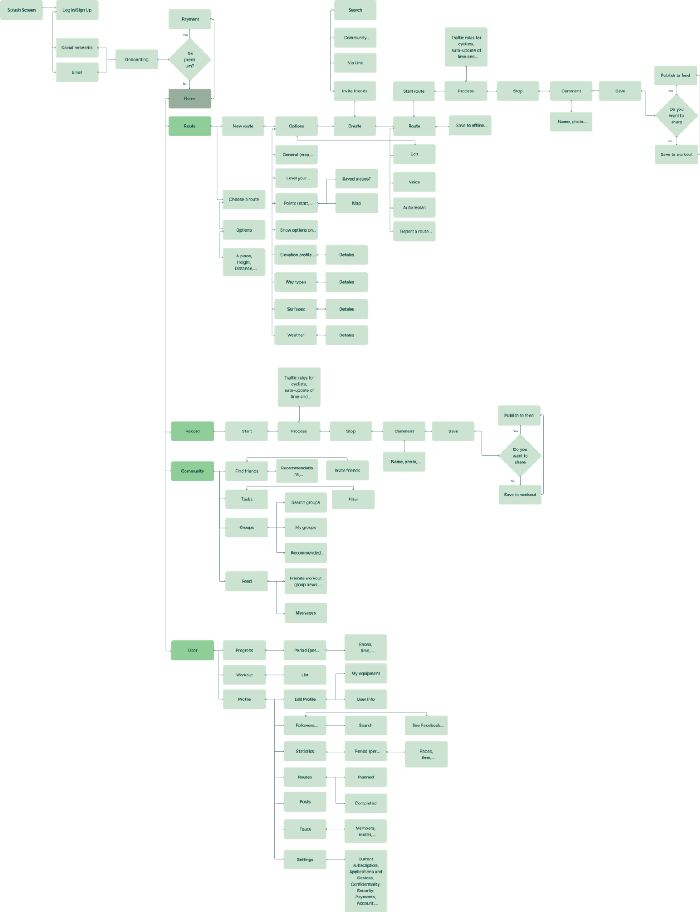
What exactly are we doing at this point? To avoid missing anything vital, I develop a diagram - a graphical tree of the application's operation — using all of the materials and data gathered in the previous stages.

user flow

App Screens

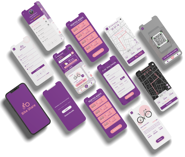
A lovely app screen representation that is user-friendly and simple to use. After all the main functionality was defined, high-detailed wireframes were developed that reflected the structure of the content and the interaction of elements.

bike share
all-sreen

Content text
Content text
Content text
Content text

We use cookies to give you the best experience. Cookie Policy